
Sketching Graffiti and Street Art in Alleys: How to Suggest Tags Without Copying Them
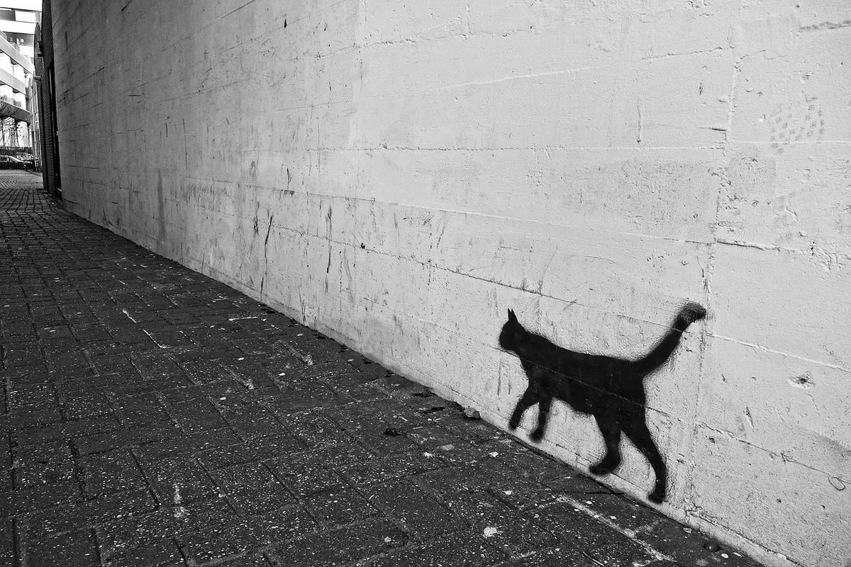
There is a particular kind of alley where the bin store has been repainted four times and the paint never quite covered what was underneath. A blue tag ghosts through the cream roller coat. A bubble-letter piece from two summers ago survives only at the edges, where a newer hand has sprayed a fast signature across its belly. You stand there with a sketchbook and feel the pull to get it all down — every letter, every drip, every date.
That impulse is worth resisting, at least in the drawing. Copying a tag exactly is slow, and it rarely looks like a sketch; it looks like a transcription. What you want is something better: a few confident marks that tell the viewer a wall was covered in writing, without pretending you can reproduce it. Suggesting is a skill, and it is learnable in an afternoon.
Read the wall before you draw it
Walls have a chronology. Before the pencil comes out, spend two minutes working out what went on first. Look for edges: where a tag disappears under a patch of roller paint, where a sticker sits on top of a spray line, where the drips run over older marks rather than under them. That order is the story of the wall, and it is far more interesting than any single piece.
Then decide what the drawing needs. A sketch of an alley is a sketch of a place, not a catalogue of other people's work. You might choose one large piece as the anchor, two or three tags as texture, and a faded older layer to give the surface some history. Everything else gets left out. This is not laziness; it is editing, and it is the same decision you make when you leave three windows blank on a building.
Cut the letters into shapes
A tag is a line with rhythm. It has a baseline, a band of height where most of the letterforms sit, and a few excursions above and below. Squint at it and the spelling vanishes; what remains is a ribbon of movement — a sweep up, a hook, a tight cluster of loops, a long tail that runs off the edge.
That ribbon is what you draw. Convert each cluster into a simple mass: a rounded rectangle, a wedge, an ellipse. Two or three of these per tag is plenty. If a piece has wildstyle arrows and interlocking forms, resist untangling them; block the overall silhouette and let the interior stay as one flat tone or a couple of loose directional strokes.
The squint test
Step back and half-close your eyes. If the shape still reads as "someone wrote something here", you have succeeded. If it reads as a grey blob, you have probably simplified too far and need one distinctive gesture back — a tall ascender, a fat loop, a sharp diagonal.
Marks that read as lettering without being readable
This is the core trick, and it is mostly a matter of where you stop. Work in this order:
- Set a footprint. Lightly draw the baseline and the top of the band. Tags sit on a line, even a wobbly one, and that line is what makes them look like writing rather than decoration.
- Block two or three masses. Not letters — masses. Keep them chunky and slightly irregular. Real spray work is never neat.
- Add one gesture per tag. A long hook, a loop that overshoots the band, a quick arrow, a dot. One. Two gestures and you have drawn a logo.
- Break the outline. Leave gaps where brick, plaster or another layer interrupts the shape. Interruption is what makes a mark sit on a wall instead of floating in front of it.
- Stop before it is legible. If you can read it, simplify again. The viewer should feel the presence of writing, not read a message.
Use a different tool for different marks. A fine felt-tip gives you the scratchy quality of a marker tag; a brush pen loaded lightly gives you the taper of a spray stroke; a dry pencil dragged sideways gives you the chalky edge of faded paint. Varying the tool is faster than varying your hand.
Colour: sample the palette, not the paint
Spray colour is flatter and more saturated than most of us expect, and in an alley it is usually fighting a grey wall and a strip of blue sky. You do not need to match it. What you need is the relationship between the colours: what is loud against what is quiet.
Three or four colours will carry a whole wall. A mid-tone wash for the wall itself, one strong accent for the loudest piece, a darker tone for shadow and outlines, and whatever the paper gives you for the light. Try placing the brightest colour in only one part of the drawing — a single hot orange tag on an otherwise grey surface will pull the eye exactly where the real one did.
Two habits help. First, test the accent on a scrap of the same paper before committing it to the sketch; watercolour dries lighter, markers dry bluer. Second, let white paper do the work of light. Alleys are mostly shadow, and a wall that is two-thirds shadow with a bright tag catching the sun reads instantly.
Layering without losing the plot
History is where suggestion earns its keep. Draw the oldest marks first and keep them pale, thin and incomplete. Ghost a roller patch over an earlier tag by leaving the tag's edges visible on one side only. Let a newer shape cut into an older one rather than sit politely beside it. A few drips at the bottom edge of a spray shape do more for authenticity than another hour of lettering.
Pick three layers and stop. Underneath, the wall; middle, the big piece; on top, one or two quick tags or a sticker. Anything beyond that turns into mud, especially in pen, where you cannot lift a mark back out.
Keep the alley the subject
Graffiti is one ingredient in a scene that also contains drains, shutters, cables, a bike locked to a pipe, a person walking through with their phone out. Those elements give scale and place. Without them, a drawing of a wall is just a drawing of a wall.
Composition does most of the work here. Frame the wall with a dark foreground — a doorway, a corner in shadow, a bin — and the writing immediately sits back where it belongs. Let one busy wall carry the detail and leave the opposite side quiet. Put a figure in the middle distance and every tag behind them suddenly acquires a size.
- Include: one anchor piece, two or three suggested tags, one older ghost layer, a foreground shadow, one human element.
- Leave out: the fourth layer, most of the lettering detail, every cable you can see, any tag you cannot place confidently in the composition.
- Check at the end: can someone who knows the alley recognise the corner? If yes, the graffiti is doing its job.
A word on manners: a wall is somebody's work, and photographing or drawing it in public space is fine, but presenting someone else's tag as your own design is not. If you post the sketch, mention the street or the artist where you know them. Sketch from the pavement rather than from inside private property, and be careful about photographing people who have not agreed to be in your drawing.
A twenty-minute exercise on the next wall you find
Choose a stretch of wall with at least three layers. Make three small boxes on one page, each about the size of a matchbox, and give yourself five minutes per box.
In the first box, draw the wall's texture only — no writing at all. In the second, add one suggested tag using the five steps above: baseline, two masses, one gesture, broken outline, stop before legible. In the third, draw the same view but with a person or a bike in front of it, and notice how much smaller the writing becomes.
Keep the three boxes. Next time you are in an alley, you will find yourself looking at walls the way you looked at the exercise: as layers, shapes and one good gesture, rather than as text you have to copy.
Photo: MabelAmber / Pixabay